Let's talk
iOS & Android Subscription tracking Local-first 2026 View live ↗

NextRenew

A subscription tracker built around the renewal date, so the next charge arrives as a reminder instead of a bank alert.

Info Project Overview

Challenge

Subscriptions rarely fail loudly. They renew quietly across a card, an app store, and three inboxes, and the total only becomes visible on the statement. By then the decision to keep or cancel has already been made by default, and the tools that could have caught it ask for a full budget setup before they show a single date.

Solution

NextRenew organises everything around the renewal date. A catalogue of 264 services makes adding a subscription a tap instead of a form, each record keeps its cost, cycle, next date, and exit options together, and a local notification arrives before the charge does. Everything lives in a database on the phone, so the app works offline and syncing stays an explicit choice rather than a condition of using it.

Result

The next charge stops being a surprise. Renewals due today, spend for the next thirty days, and a six-month trend are visible on opening the app, and the reminder lands while cancelling is still an option.
Know what renews next, while there is still time to decide.
How I built it

Every screen is built around the next renewal.

I worked backwards from the moment the charge lands: show what is coming first, make adding a service a tap, keep the cost and the exit on one screen, and send the reminder while there is still time to act.

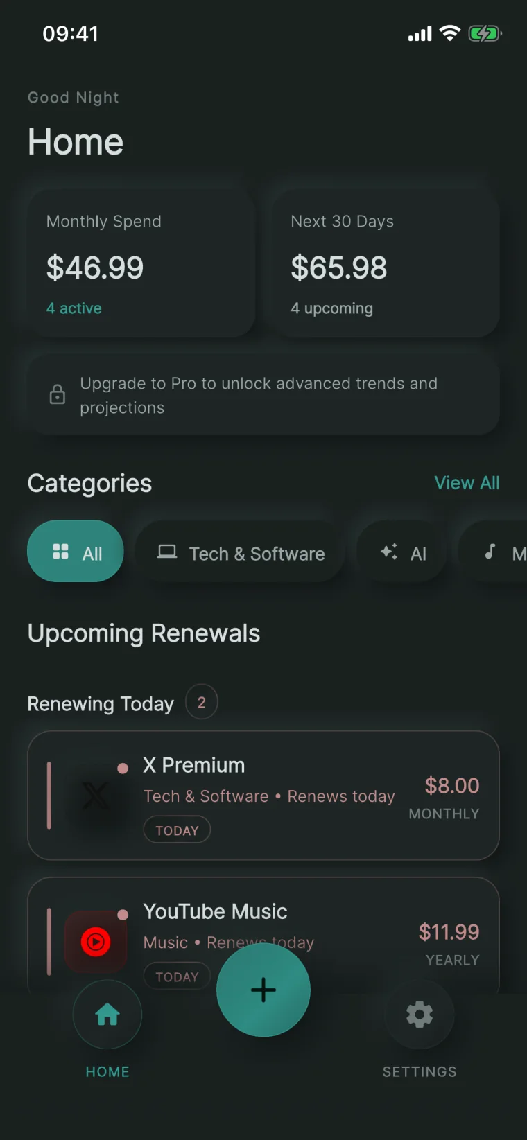
NextRenew home screen showing monthly spend, next thirty days of charges, category filters, and the subscriptions renewing today
What it does

What is coming, before it arrives

The home screen answers the two questions that actually get asked: what am I paying each month, and what is about to charge me. Monthly spend and the next thirty days sit above a list that leads with anything renewing today.

The thought process
  • Lead with the renewal date, not the ledger

    People do not open a subscription app to audit their spending; they open it because something is about to charge them. Monthly spend, the next thirty days, and today's renewals sit at the top, so the app answers that question before anything else.

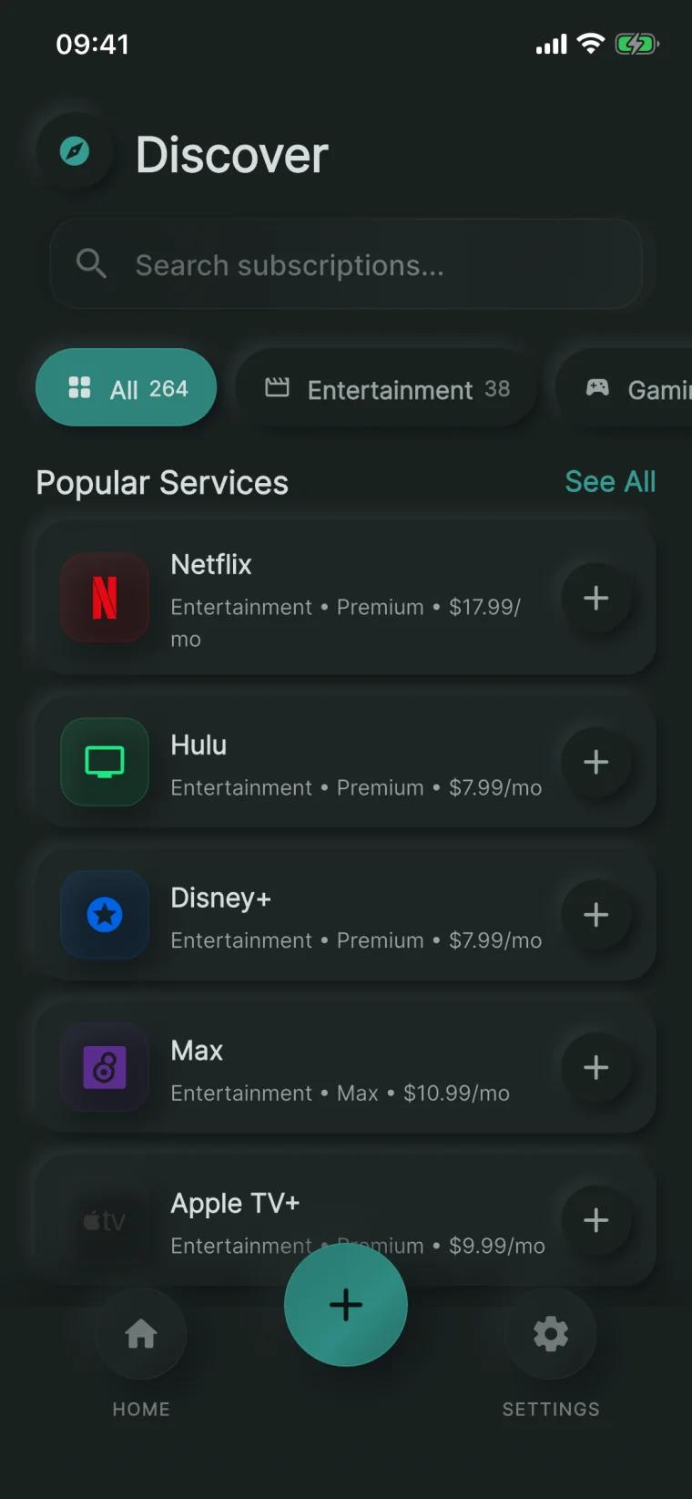
NextRenew discover screen with a searchable catalogue of 264 subscription services grouped by category, each addable in one tap
What it does

A catalogue instead of an empty form

264 services ship with the app, each with its category, common plan, and typical price. Adding Netflix is a tap rather than four fields, and the search is local so it answers instantly and offline.

The thought process
  • Ship the service catalogue with the app

    An empty add-form asks for a name, a price, a cycle, and a date before returning any value. Bundling 264 services with their categories, plans, and typical prices turns the first subscription into one tap, and keeps search working with no network.

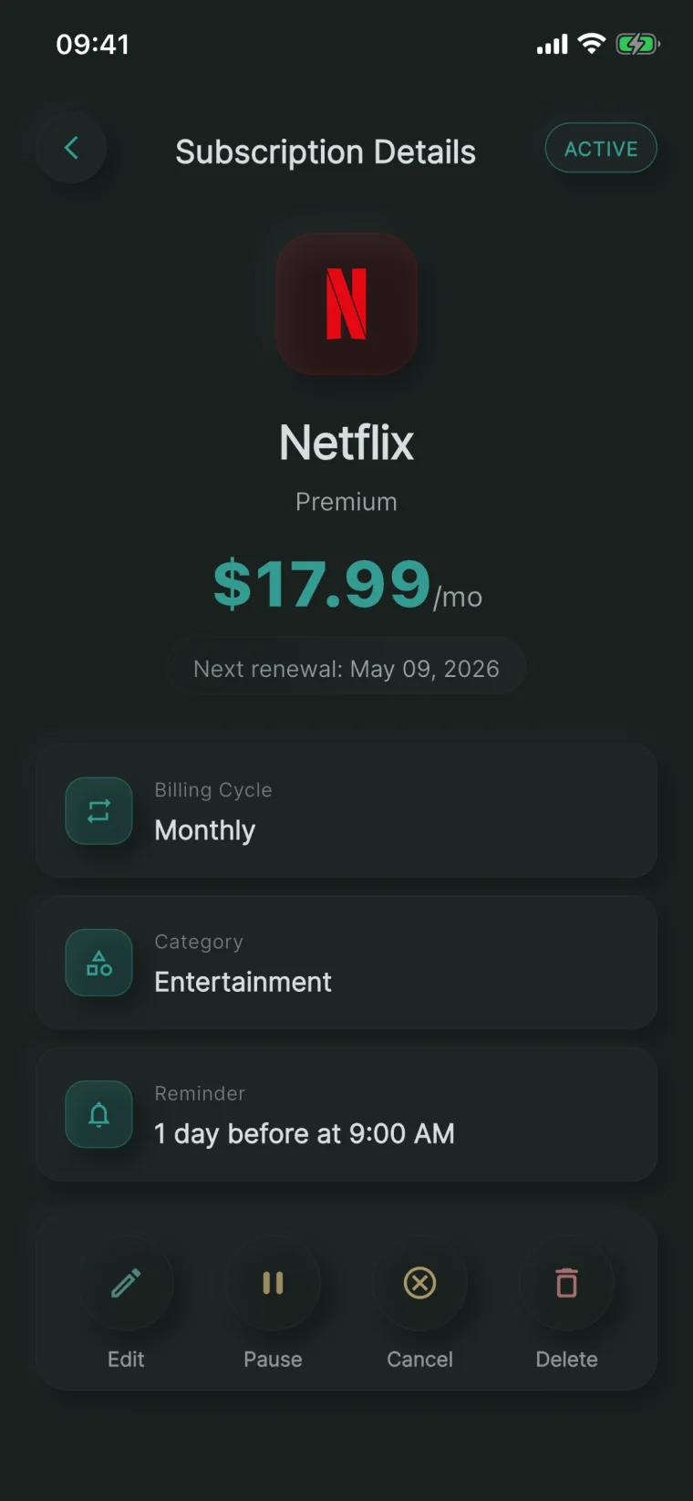
NextRenew subscription detail screen for Netflix showing price, billing cycle, next renewal date, reminder setting, and edit, pause, cancel and delete actions
What it does

The cost and the exit on one screen

Price, cycle, next renewal, category, and reminder read as one block, with edit, pause, cancel, and delete directly beneath them. The moment someone questions a subscription is the moment they should be able to act on it.

The thought process
  • Keep the cost and the exit together

    Deciding to cancel and being able to cancel usually live on different screens, and the gap is where subscriptions survive. Price, cycle, next renewal, and reminder sit directly above edit, pause, cancel, and delete.

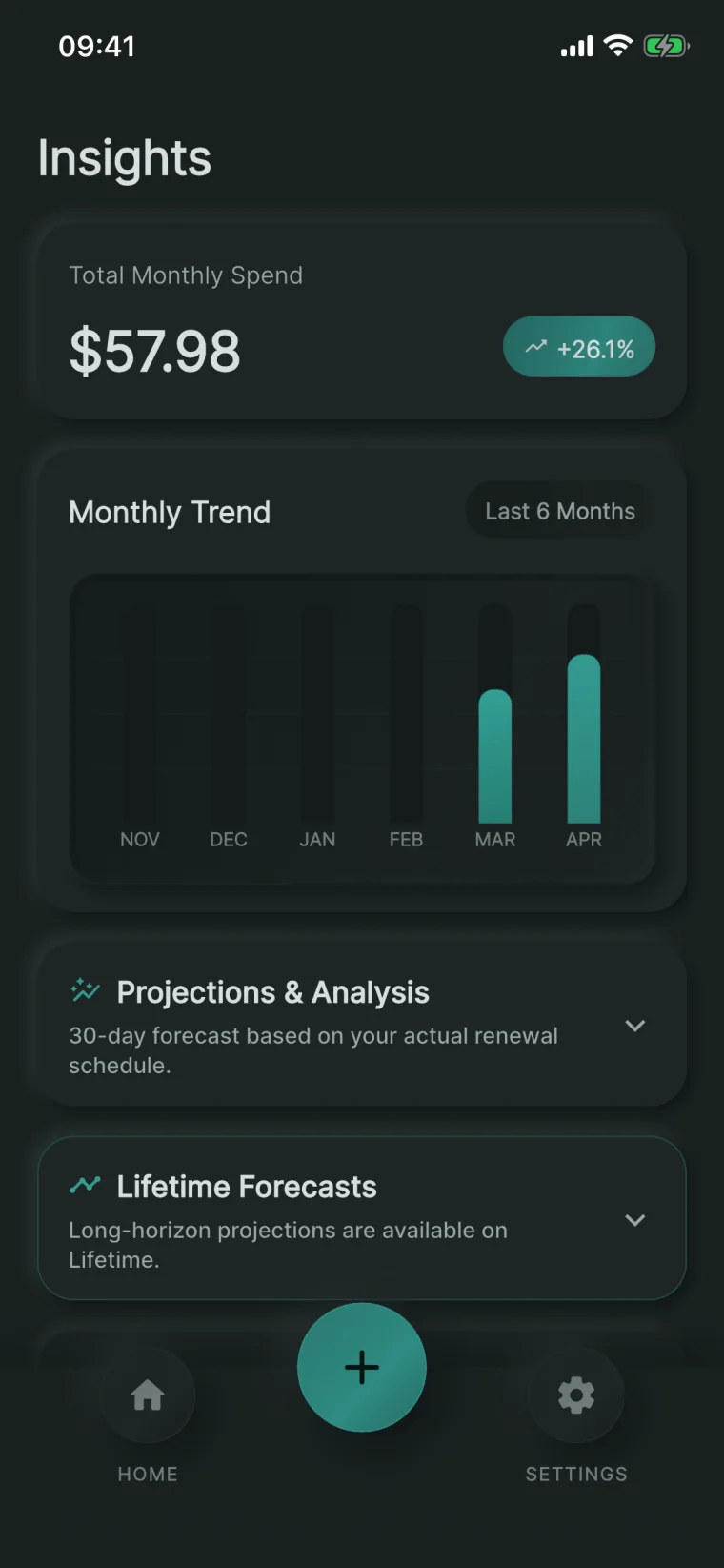
NextRenew insights screen showing total monthly spend, a six-month trend chart, and a thirty-day projection based on the actual renewal schedule
What it does

Spend you can see coming

The trend is six months of real totals and the forecast is built from the renewal dates already stored, not from a monthly average. A yearly plan renewing next week shows up as the spike it is.

The thought process
  • Forecast from the real schedule

    Dividing an annual plan into twelve equal months hides the month it actually lands in. The projection reads the stored renewal dates, so an upcoming yearly charge appears as a spike rather than an average.

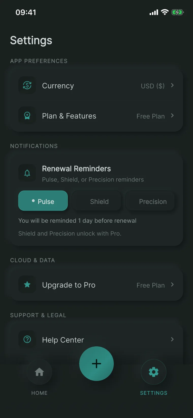
NextRenew settings screen showing currency and plan preferences alongside Pulse, Shield and Precision renewal reminder modes
What it does

Reminders set once, then left alone

Three named modes replace a lead-time picker: Pulse warns a day out, Shield two, and Precision takes a custom day and time. Notifications are scheduled on the device, so the warning does not depend on an account or a connection.

The thought process
  • Name the reminder modes instead of asking for a number

    Almost nobody returns to a notification screen to tune a lead time. Pulse, Shield, and Precision give a sensible default, a cautious one, and a custom option, so the choice is made once in a sentence rather than in a set of pickers.

  • Store on the device, make sync a choice

    Subscription records describe what someone pays for and when their card is charged. The database is local, notifications are scheduled on the device, and optional sync writes to hidden app storage rather than a visible cloud folder, so the app is fully usable without an account.

Renewals you decide on, not discover.

NextRenew keeps every subscription, its real cost, and its next date on the phone, and puts the reminder in front of the charge instead of the statement.

View NextRenew ↗
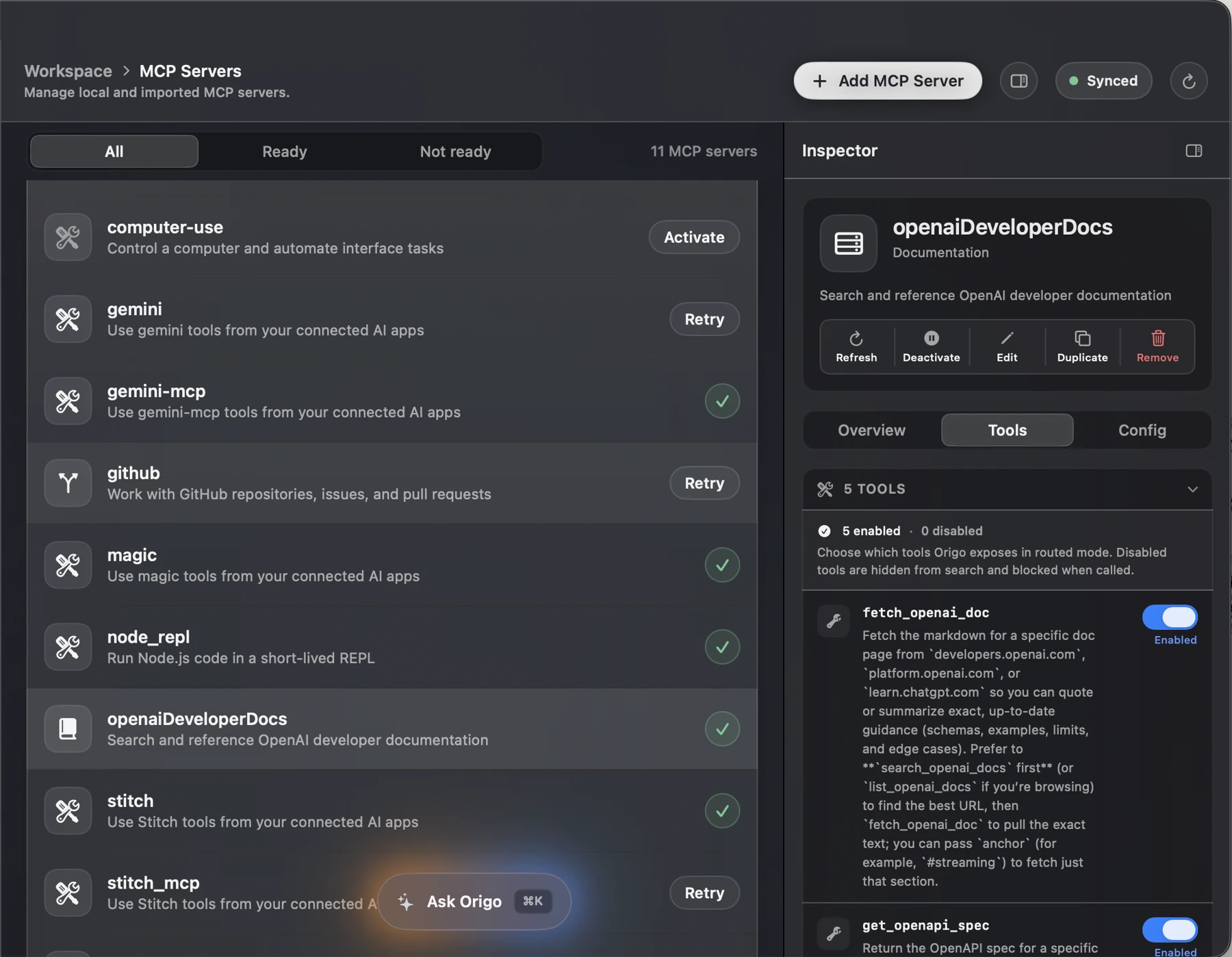
Dark-mode Origo MCP Servers screen with a canonical server list, tool controls, and detailed inspector Next project Origo See project